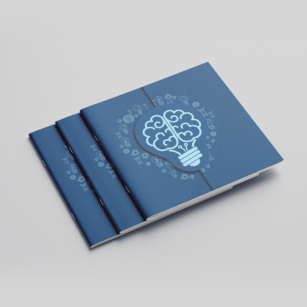
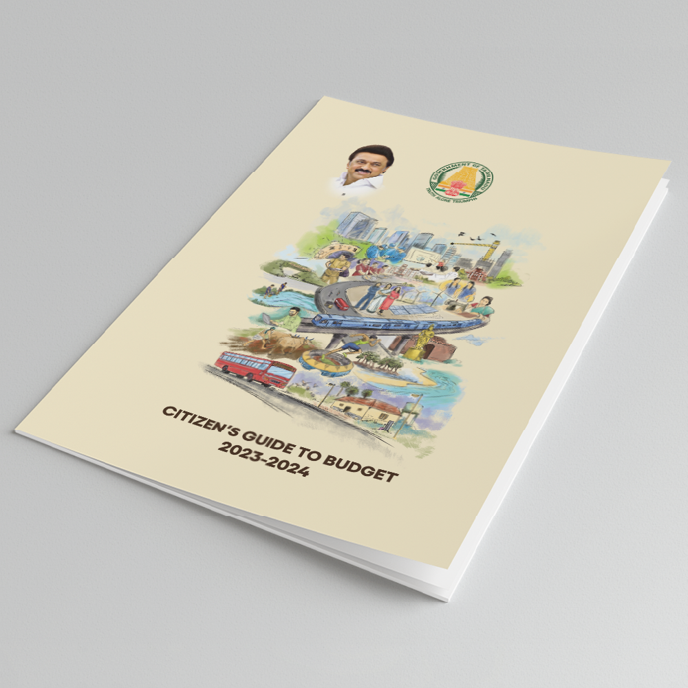
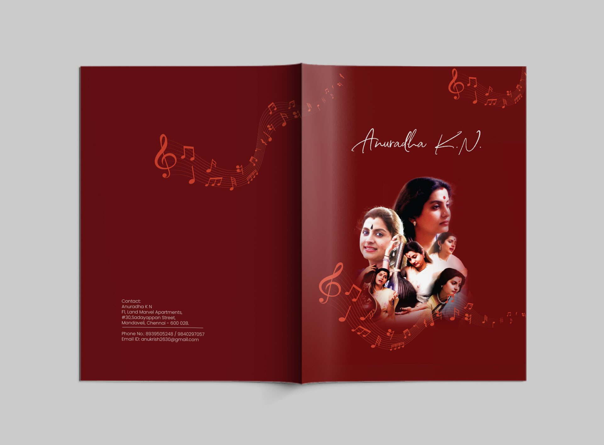
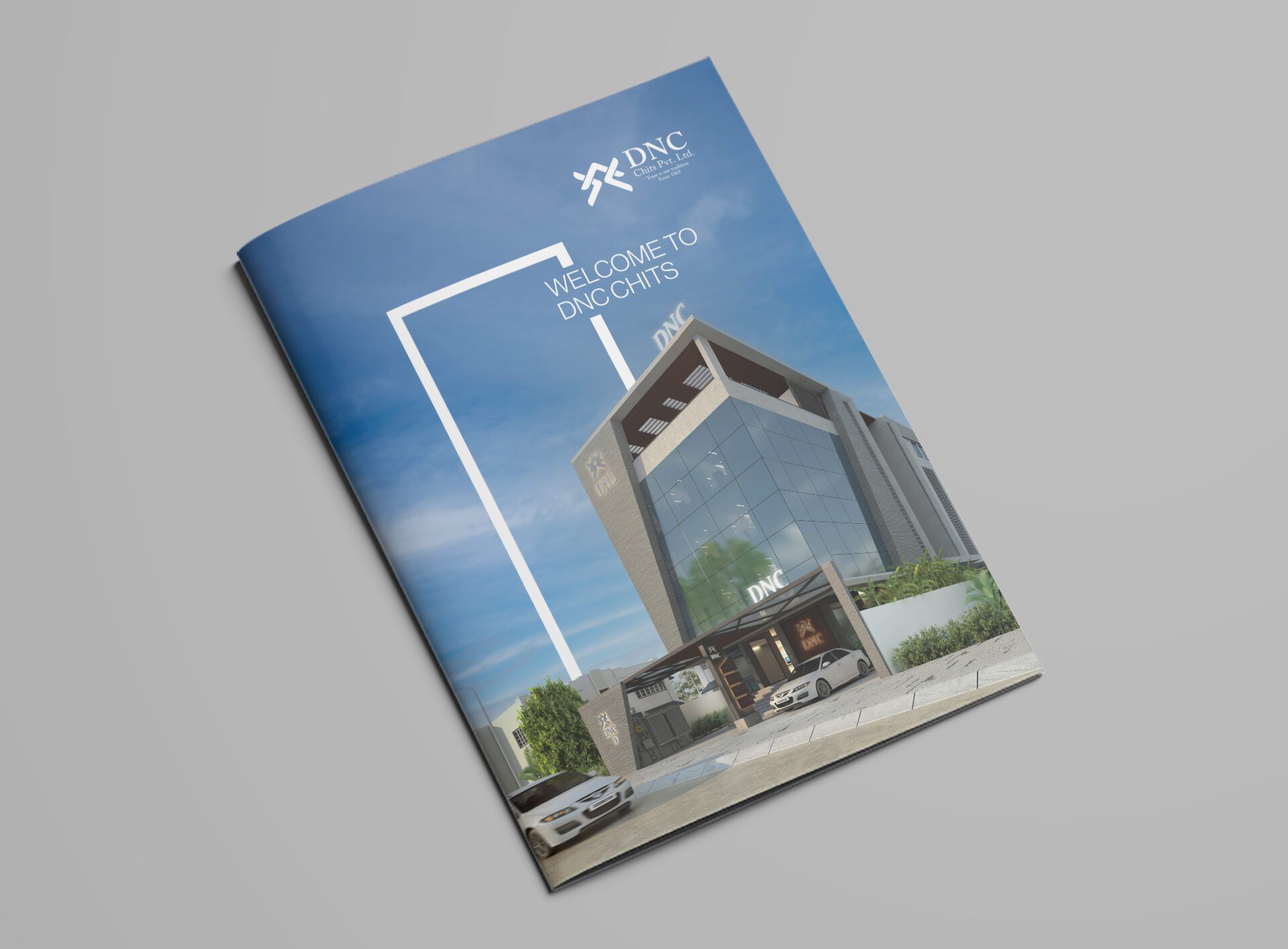
Brochures
Brochures are an excellent tool to spread the word about your offerings, upcoming events, promotions or conferences. In today’s post, I gathered 13 of the best brochure ideas to help you design clear, beautiful and useful marketing assets.
Let’s get started!
A top graphic design trend is the use of bright colors and bold fonts. These colorful alternatives to the popular minimalist design is a great choice for a brochure that needs to get your audience’s attention.
Brands can use extremely eye-catching color schemes and typography that stands above other content. It’s hard to resist opening brochures that utilize this idea, making it an excellent approach to highlighting your message.
One of the core challenges of designing a brochure is space. You have a limited amount of space to communicate your important message.
To achieve optimal clarity, it’s crucial to organize your content effectively. This way, you can include all of the information your reader needs while not overloading them with too many words.
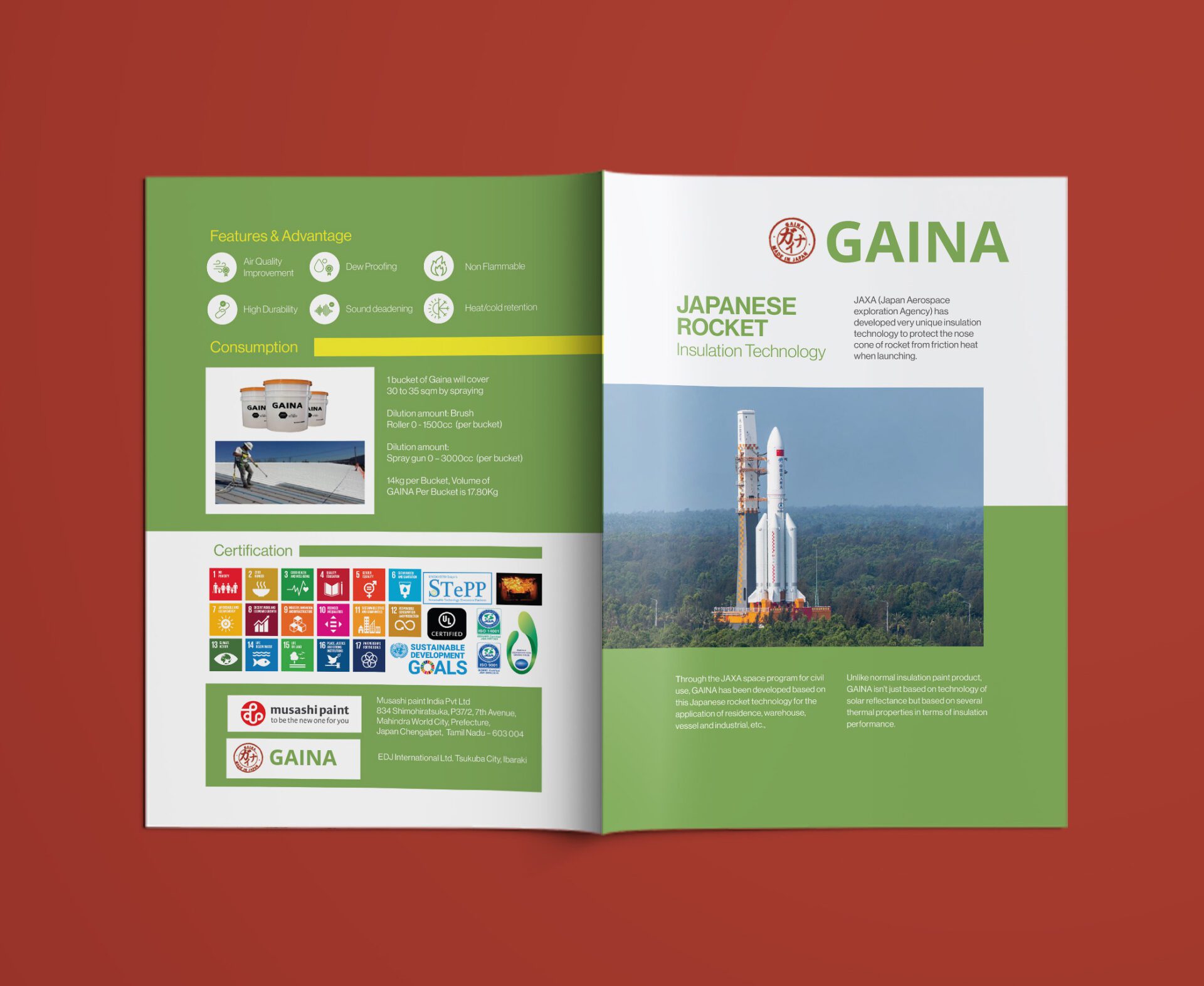
An effective way to achieve this clarity is with color design.
When you use contrasting backgrounds for various sections in your brochure, the reading experience becomes more enjoyable. You can use a tool like Visme to make sure all of your visual elements are balanced properly.
Making the right typography choice is an excellent way to take your brochure ideas to the next level. Specifically, it’s possible to use a bold font to make the overall message of your brochure crystal clear.
Font choice will often depend on the topic of your brochure. For example, if you’re raising awareness for a serious cause you might choose a heavy font.
Conversely, a light or minimal font may be a better choice for brands that want to express a sense of joy or fun.
Fonts are a powerful design element that can influence your audience’s behavior. It’s a great idea to take some time to make a strategic choice.
Illustrated icons are a popular design element. They are also a great addition to try out on your brochure.
Icons can help make brochures seem genuine. Additionally, when there is a significant amount of content you need the reader to observe, icons and photos alike are great ways to add personality to your design.
Take a look at the brochure above. Many real estate brochures have industry standard requirements. Because of these limitations, illustrated icons and photos are an excellent way to include visual elements in a design.
In the above example, the design team uses an illustrated house icon to emphasize an important section of marketing copy, as well as incorporating high-quality photos throughout each page.
Emphasizing statistics as a crucial visual focal point is a great choice for your brochure design. Large numbers are always eye-catching, and can easily be used as a central design element.
Statistics are helpful for stopping readers who are casually flipping through in their tracks. Because of this, they should be used in conjunction with the important messages you want to communicate.
The designer of this corporate business brochure uses stark lines and interesting angles to highlight the statistics in the brochure. Additionally, using a more bold color underneath the statistical message draws the eye directly to the central section.
These choices highlight the importance of designing a brochure to amplify the most important messages.
The use of color contrast goes a long way to help a particular message stand out.
Through the use of intelligent design, you can create a sensible hierarchy that guides your audience to the content they need the most.
In particular, the use of complementary colors

